Context
Great patterns. Painful documentation. Teams were skipping the guidance entirely.
Carbon Design System is IBM's unified design language used by 324 teams, powering 640k+ GitHub repositories, and reaching 450k+ monthly visitors. The patterns were solid. But the way guidance was delivered wasn't working.
Teams were building onboarding experiences inconsistently not because they didn't care but because the documentation was too long, too text-heavy, and too disconnected from how designers and developers actually work. Long pages discouraged engagement. Teams wanted visuals. Developers wanted code alongside the guidance.
The challenge
How do you get 324 product teams to adopt the same pattern when the documentation is too long for anyone to read?
I was brought in to change how Carbon taught its own system and in doing so, directly shaped the 2026 Carbon site relaunch.
The larger challenge
A design system nobody could learn from.
IBM wanted to stop being seen as slow and complex. Carbon was the lever for that: one design system across every product, so teams could ship faster and more consistently.
Carbon is big. Not just components, but 40+ product workflows in code, 30+ chart types, 2000+ icons, and accessibility that works out of the box.
40+
Product workflows
Proven flows available in code, so teams pull them off the shelf instead of rebuilding.
2000+
Icons and pictograms
Built with IBM Brand to give shape to complex enterprise tasks.
30+
Chart types
Data visualisation with table views and export built in.
WCAG
Accessible by default
Conformance and right-to-left language support without extra work.
That size is exactly why the documentation mattered. When a team cannot find the right pattern, they do not pick a worse one. They build their own. The system stops paying for itself, quietly, one team at a time.
Where I came in. Carbon's strategy ran through four stages: Find, Guide, Assist, Emerge. I worked on Guide, turning reference documentation into something people could actually learn from.
Research
Talking to the people the docs were not working for.
I ran this study with Carrie Chung, a user researcher on the Carbon team. Eight interviews: four designers and four developers, all power users from IBM software and infrastructure business units who used the Carbon sites daily or weekly. The objective was to understand what people search for, the mental model behind it, and how the search experience actually holds up.
Why start with search. Documentation only fails in one of two ways: the content is wrong, or people cannot get to it. Before rewriting anything, we needed to know which one we were dealing with.
What we got wrong
Two of our three assumptions did not survive.
We wrote down what we expected before the interviews so we could be held to it. Most of it was wrong, and the wrong parts were the useful parts.
Makers search for implementation examples, not components
They look up components to get a high-level understanding and see visual examples first. The detail comes later, if at all.
Developers want to filter results by their framework
They search for general information on color, typography, icons, and components. For framework detail they go straight to Storybook. We would have built a filter nobody asked for.
This is really about a generative AI conversation
The most useful finding of the study. There was real skepticism about generative AI as a search replacement. Users wanted the original source.
How people actually searched
Everyone had a workaround. That was the finding.
People searched in short, specific terms: "dropdown", "color tokens", "migration", "onboarding". The width of the search bar visibly influenced how much they typed. But the more revealing pattern was what they did instead of using search.
Actual queries from the interviews. Short, specific, mostly one or two words.
Left navigation
Designers knew the site well enough that clicking through the nav was faster than searching it.
Command + F
Expanding every section of a page and using the browser's own find, rather than the site's search.
Multiple tabs
The Carbon Design System site and Carbon for IBM Products open side by side, because nothing cross-referenced between them.
Slack, then Google
Developers asked in channels. Several said Google was more accurate and faster than searching Carbon directly.
The uncomfortable part. People were using Google to find pages on our own site, because Google gave them visuals and told them where the answer came from. That is not a search bug. It is a signal about what the guidance experience needed to become.
Visual pain points
You could not find search, or read it once you did.
I split the findings into visual and functional on purpose. The two groups had different owners and different fixes. One was a design problem I could act on. The other needed engineering.
Visual hierarchy is not clear
The search icon sat in the top right corner at the same weight as everything around it, and people missed it entirely. When they did find it, the results were unreadable: too many suggestions, no way to prioritise, and descriptions that repeated the same sentence without adding anything.
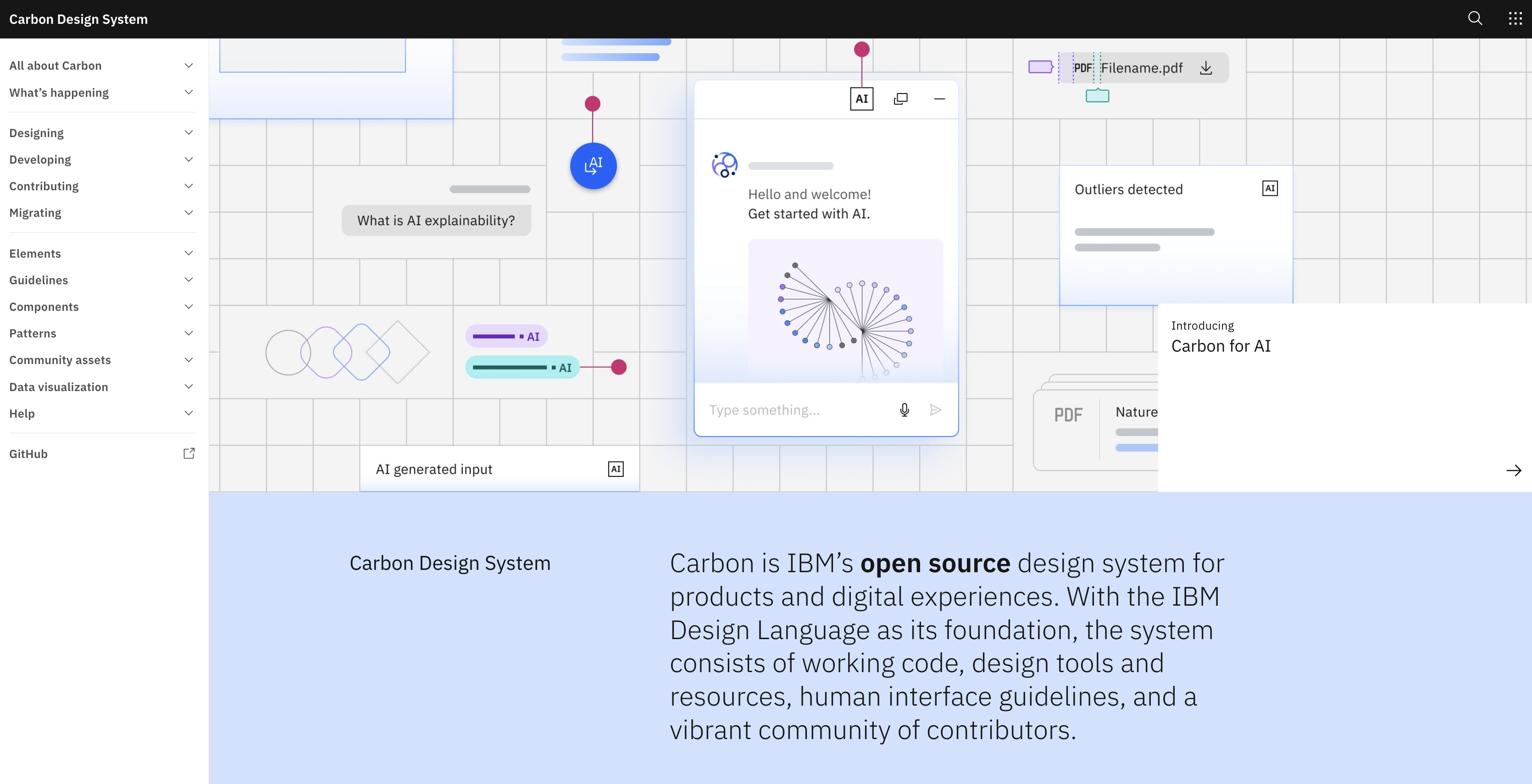
The search icon in the site header, easy to miss entirely
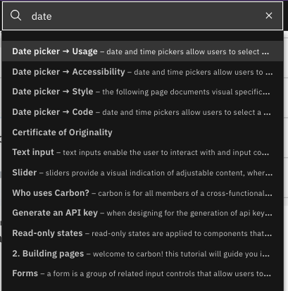
Searching "date" returns a wall of near-identical suggestions
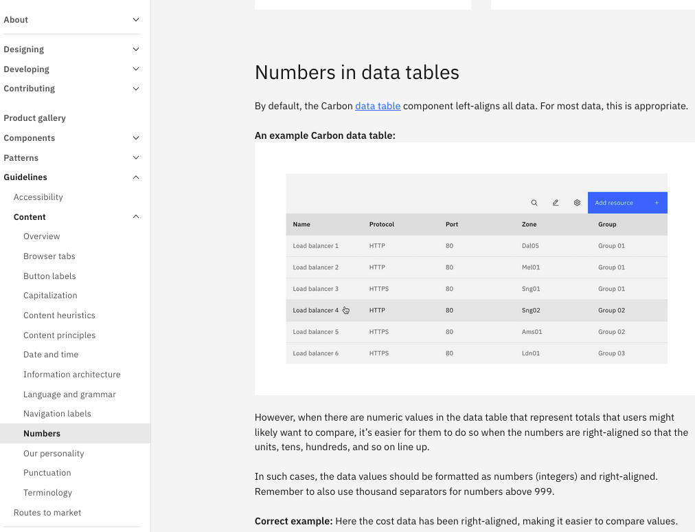
Category matching is missing
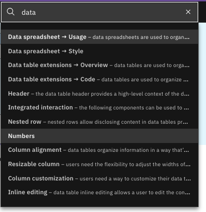
Nothing in a result told you what kind of thing it was. "Numbers" appears in the list with no label, while every row around it says Usage or Style. On the site it lives four levels deep under Guidelines and then Content. Search gave you the destination without ever telling you the neighbourhood.
Functional pain points
The search matched characters, not meaning.
It does not recognise a misspelling
One transposed letter returns nothing at all. Not a suggestion, not a did-you-mean. An empty box.
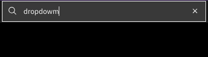
One transposed letter in "dropdown" returns nothing
It does not recognise outdated pattern names
People search using the name they learned, which is often the name a pattern used to have. Searching "novice to pro" returns Overview and Contacts rather than the onboarding guidance it describes.
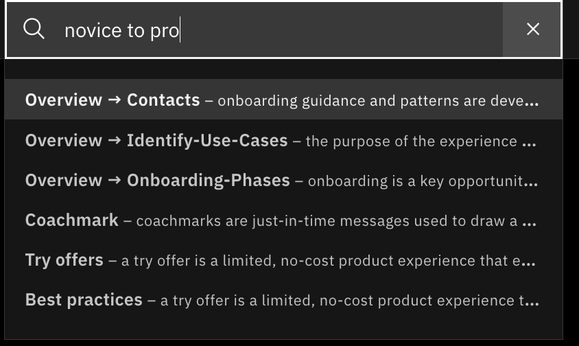
Searching "novice to pro" returns unrelated results
There is no cross-referencing between the two sites
The Carbon Design System site and Carbon for IBM Products do not reference each other, so people kept both open in separate tabs just to find a pattern. Searching "onboarding" surfaces Empty states and Progress indicator, but not the onboarding patterns living on the other site.
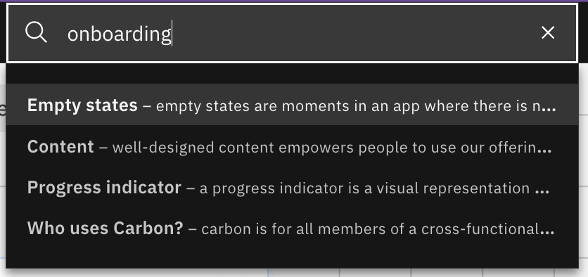
Searching "onboarding" misses the patterns on the other Carbon site
Results are often irrelevant
Searching "drop" returns File uploader, Import, Contained list, Form, Global header, Modal, Data table, Tile, and Color. Character matching rather than meaning. Nobody could tell why a result was suggested or how it related to what they typed.
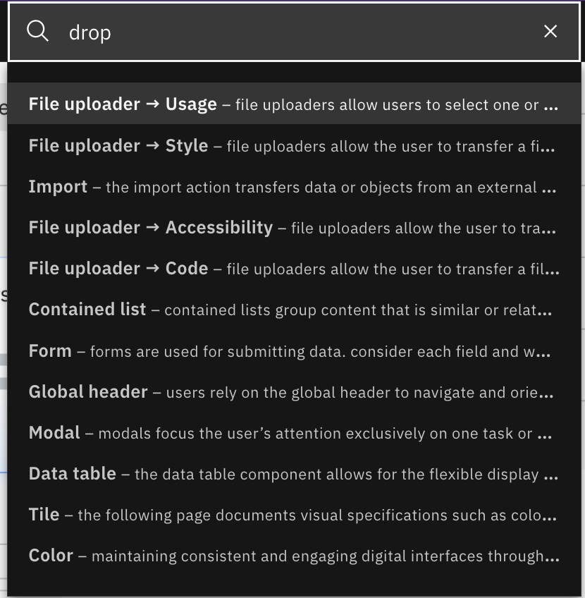
Searching "drop" returns File uploader and nine other unrelated results
On generative AI
Can generative AI replace search?
We went in expecting yes. The interviews said no, and were specific about why. Search and generative AI were understood to serve different jobs: AI for generating, debugging, and summarising when you are not sure what you need; search for going straight to the source when you already know. The consistent concern was hallucination.
"A problem with generative AI is that it sells very well, like a salesman. If you read a summary you think it fits so perfectly, but to really know what it is talking about you will find things that are wrong."
Developer, participant 2
Research interview, Carbon search study
What this changed. It shifted the recommendation away from replacing search with a chat interface and toward making guidance findable and trustworthy in its own right: content summaries with visuals, and links back to the original source so people can verify. Trust was the requirement, not intelligence.
Recommendations
What we handed back.
The playback closed with recommendations grouped by how quickly they could move, from interface fixes through to the harder architectural work.
Search bar and results
Make the search prominent on the landing page. Highlight matching characters as people type. Add type-ahead, tolerate typos, rank the most relevant result first, and group results by where they sit in the navigation.
Usability and discovery
Previews so people can identify a result without committing to a click. Visual cards for components, patterns, and icons. Flag deprecated components with the alternative. Surface renamed components under both names.
Information architecture
Global search that reaches icons, not just the left nav. Cross-referencing between the Carbon Design System site and Carbon for IBM Products, so people stop opening tabs. A clear statement of what each site is for.
Community and follow-up
Use analytics on what people search to drive community calls. Survey external users. Follow up with newcomers to understand the getting-started experience from the outside.
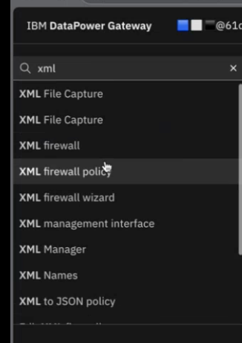
References I pointed to rather than designing from a blank page: character highlighting, type-ahead, and results grouped by category.
"The guidance was valuable. The format was the problem."
Key finding from user research interviews with IBM designers and developersFrom findings to direction
What the research changed.
A playback is only worth the time if something moves afterward. These findings did not stay inside a search project. Each one is traceable to a decision in the tutorial format.
Finding
People went to Google for visuals and sources
Decision
Video first, plus direct Figma and code links. If people leave to find visuals and provenance elsewhere, the guidance has to supply both.
Finding
Long-form pages read as abstract and academic
Decision
A three to five step cap. Not stylistic. It forces the writer to decide what actually matters.
Finding
Developers left the page to find code
Decision
Component code inside the tutorial rather than one link away. The finding that most directly changed the anatomy.
Finding
No cross-referencing, so people opened tabs
Decision
A related patterns block closing every tutorial, turning isolated pages into a path.
Finding
Skepticism about generative AI replacing search
Decision
Summaries that cite and link to the source, not a chat interface standing in for documentation.
The wider shift. The study reframed the problem for the team. Carbon did not have a content gap, it had a delivery gap: strong guidance that people could not find, scan, or trust quickly enough to use. That reframing is what moved the work from publishing design system resources toward actively teaching teams how to apply them.
The problem
Strong guidance, unusable format.
The research exposed a system problem rather than a content problem. Carbon had strong guidance, but its long-form, abstract format made it difficult for makers to translate that guidance into real product decisions.
Too abstract
Makers needed visual storytelling and real-world examples to understand how patterns worked in context.
Too fragmented
Developers had to move between resources to find guidance, components, and code.
Too difficult to consume
Long-form documentation made it harder to quickly understand and apply patterns.
Design process
From long docs to short steps evolving how Carbon teaches.
Defined the new tutorial format
Working from the research insights, I defined a repeatable tutorial structure that every guidance page would follow short, scannable, and actionable from the first scroll.
Designed the tutorial anatomy
Each tutorial page was built around five components: a short video showing the experience in action, three to five clear steps breaking down the flow, a Figma pattern link for designers, component code for developers, and related patterns for next steps.
Applied the format to the Interstitial pattern
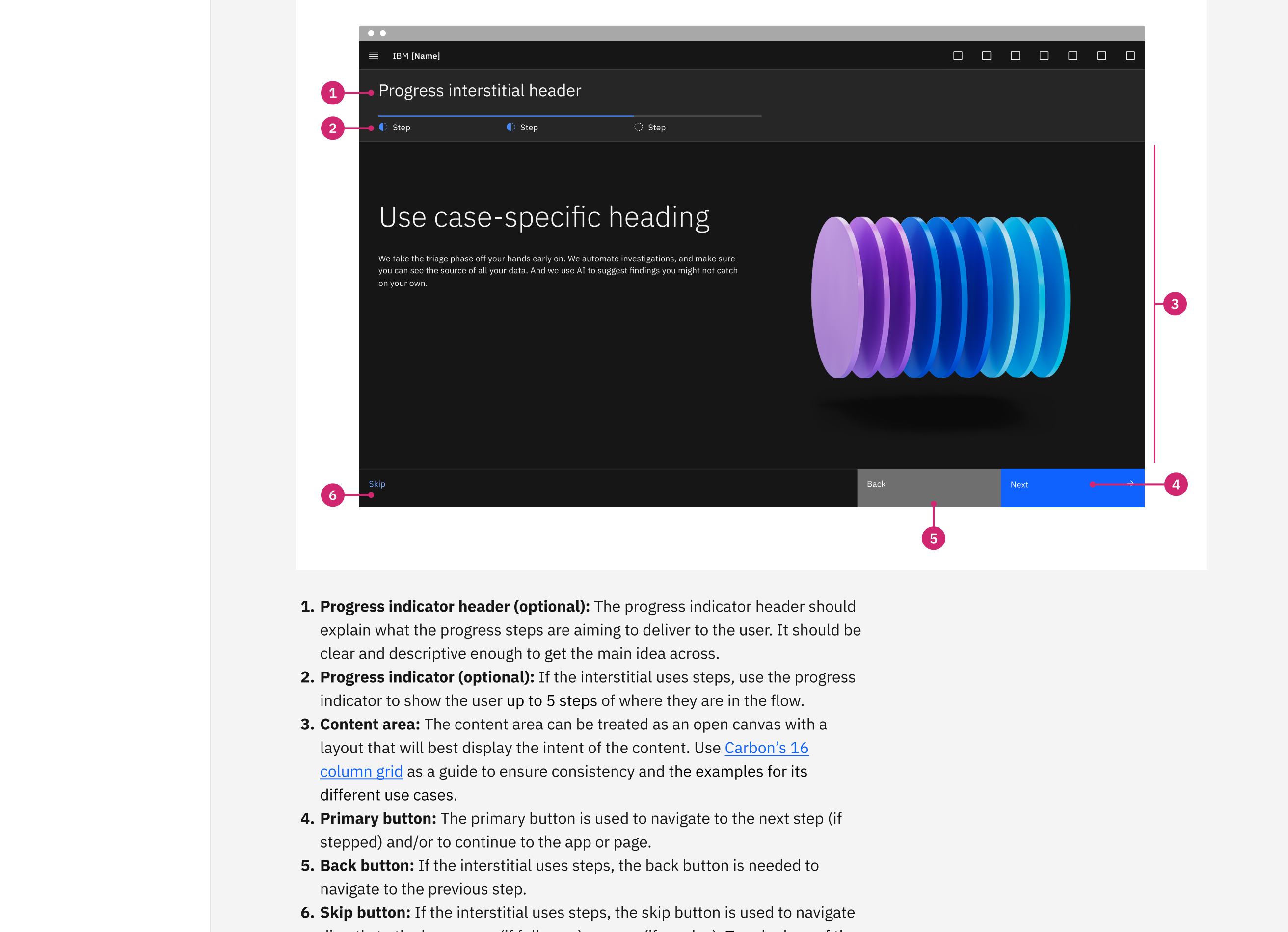
I used the PLG Interstitial onboarding pattern as the first case converting its existing static documentation into the new tutorial format, validating the structure with real teams.
Shaped the 2026 Carbon site relaunch
This work directly informed the redesigned Carbon Design System site planned for launch in 2026. I owned the guidance and tutorial experience area defining how all future patterns would be documented and taught.
From long docs to short steps
Evolving how Carbon teaches
Seeing how teams used the Interstitial in practice revealed a gap that was not about the pattern at all. It was about how the pattern was taught. Carbon's documentation was written for reference, not for learning.
We ran research on how teams actually used the Carbon site: what they searched for, where they dropped off, what they wished existed. Long pages discouraged engagement, developers wanted code alongside guidance, and designers wanted visuals, not walls of text. The format was the problem, not the content.
"The guidance was valuable. The format was the problem."
Defined the new tutorial format
Working from the research insights, I defined a repeatable tutorial structure that every guidance page would follow: short, scannable, and actionable from the first scroll.
Designed the tutorial anatomy
Each tutorial page was built around five components: a short video showing the experience in action, three to five clear steps breaking down the flow, a Figma pattern link for designers, component code for developers, and related patterns for next steps.
Applied the format to the Interstitial pattern
I used the PLG Interstitial onboarding pattern as the first test case, converting its existing static documentation into the new tutorial format and validating the structure with real teams.
Shaped the 2026 Carbon site relaunch
This work directly informed the redesigned Carbon Design System site planned for launch in 2026. I owned the guidance and tutorial experience area, defining how all future patterns would be documented and taught.
From strategy to experience
See it. Understand it. Build it. Keep going.
The strategy called for step-by-step tutorials that could bridge the gap between individual components and complete product experiences. I translated that direction into a repeatable tutorial model designed around how designers and developers actually work.
See it
Understand it
Build it
Continue learning
The goal was not simply to shorten documentation. It was to create a scalable way for Carbon to teach teams how to build better product experiences.
Designing for where Carbon was going next. This work landed during Carbon's transition from Find to Guide: moving beyond publishing design system resources toward actively helping makers understand and apply them. The tutorial framework became part of the foundation for the redesigned Carbon experience as the system moved toward AI-assisted guidance.
Tutorial anatomy
Five components, every time.
Every guidance page has the same five parts, in the same order. Read one tutorial and you know where to look in the next one. The order follows how people actually work: see it, understand it, build it, find what is next.
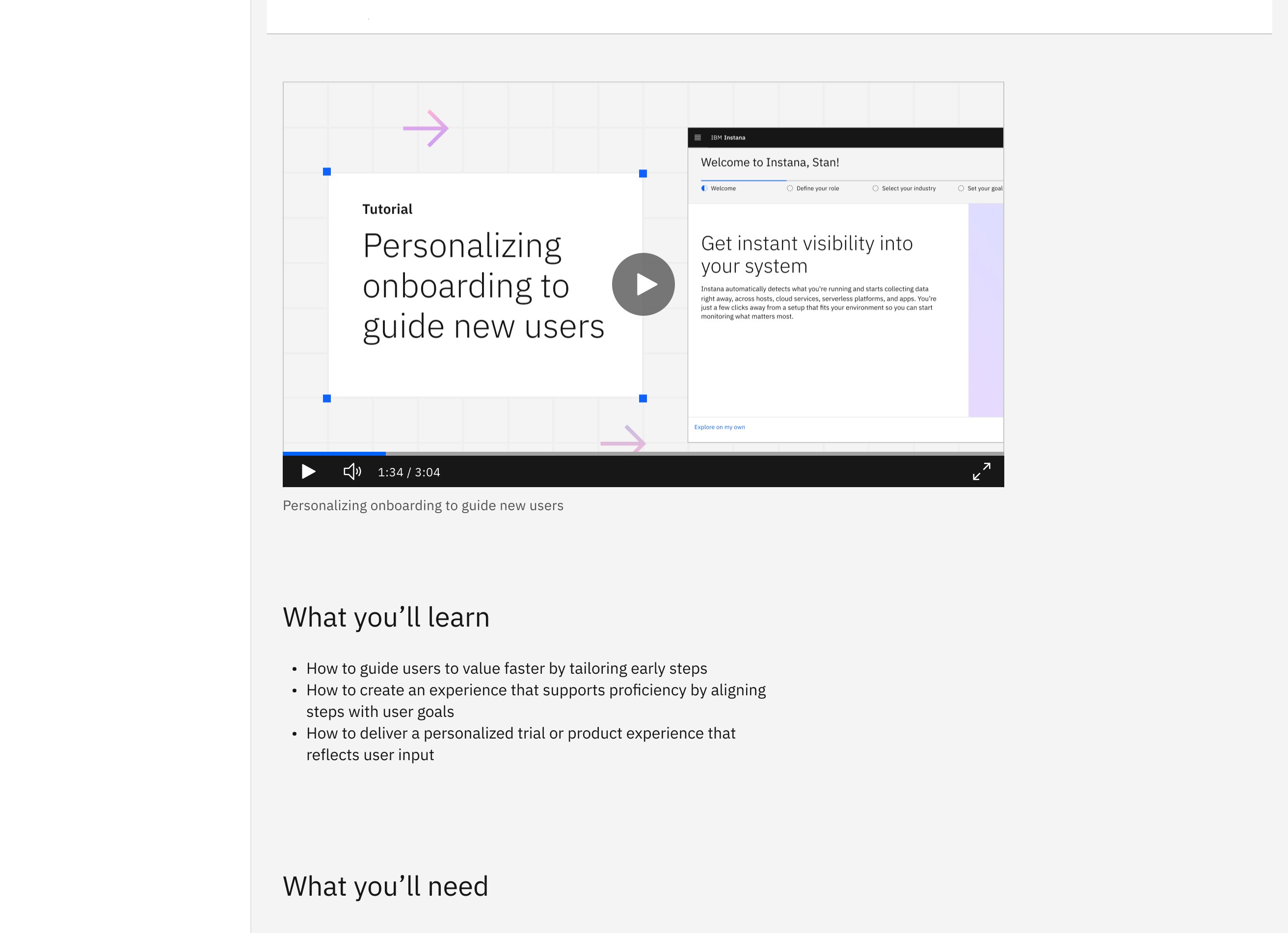
A short video of the experience
Before any explanation, you see the pattern working. Designers judge a pattern visually in seconds, and a still image cannot show a flow that unfolds over time.
Three to five numbered steps
The flow broken into discrete decisions. Capping it forces the writer to identify what actually matters instead of documenting every branch.
A Figma link for designers
Straight into the pattern in the Carbon kit. No hunting through a shared library to find the artboard the page is describing.
Component code for developers
The research was blunt on this point: developers wanted code beside the guidance, not a link to it three pages away. Guidance a developer has to leave the page to act on is guidance they skip.
Related patterns to move on to
Onboarding is rarely one pattern. Ending each tutorial with the logical next one turns isolated reference pages into a path through the system.
Why a fixed anatomy. A repeatable structure is what lets other people write tutorials without me. The format had to survive being handed to contributors across the system, which meant it had to be a template rather than a set of preferences.
Making the video
Built so someone else could make the next one.
Every tutorial opens with a short video, so the format only scales if producing one is realistic for whoever writes the next tutorial. That meant the tooling decision was a design decision, not a production detail. I met with motion designers across IBM to work out which method would let any team contribute later, not just the people who already own motion software.
Premiere was ruled out on access, not capability
It produces the best result and it is the wrong answer here. The learning curve is steep even for some designers, and the license is the harder blocker: product managers do not have one, and neither do all designers. A format that only licensed motion people can contribute to is a format that stops growing the moment I leave the team.
Keynote was ruled out on skill and time
Widely available, but building something that reads as motion design rather than a slide transition takes real animation knowledge, and it is slow. Asking a contributor to spend a day on a ninety second video means they will skip the video.
Adobe Express was the answer
Low barrier to entry, broadly accessible across roles, and good enough for the job the video actually does: show the pattern working before anyone reads a word. I linked the source file so the next contributor starts from a working template rather than a blank canvas.
Voiceover ran into an approval wall
I tested external AI voice tools including ElevenLabs, which had not cleared IBM's approval process. I moved to an internally approved tool instead. Slower to get to, but a tutorial format that depends on unapproved software is not a format anyone can adopt.
The video that opens the personalization tutorial. Produced in Adobe Express with an internally approved AI voiceover.
What this was really about. The constraint was never which tool makes the nicest video. It was which tool lets a product manager in another org contribute a tutorial two years from now. Picking the more limited tool on purpose is what makes the format a system rather than a thing I made.
The result
The redesigned guidance experience
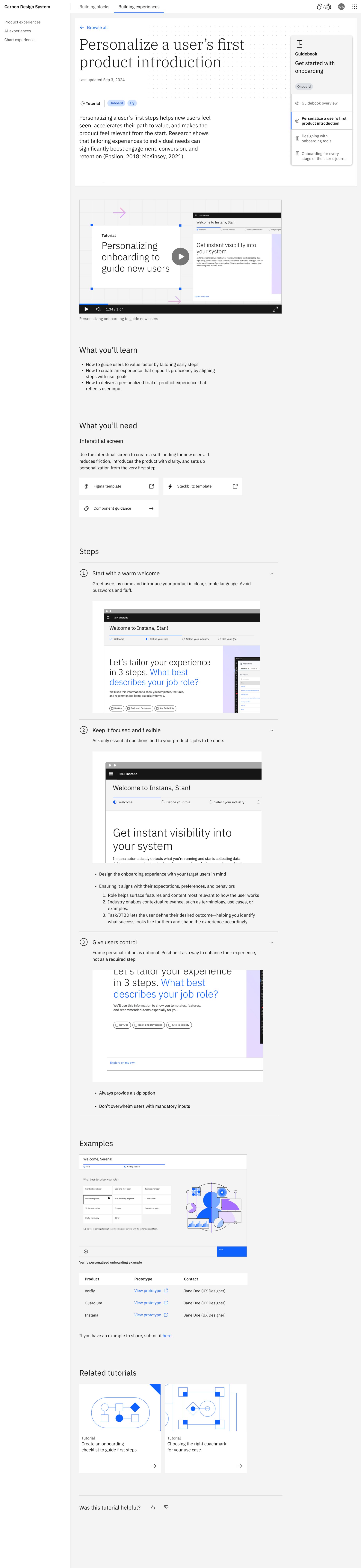
The new tutorial format changed how IBM teams learn to use Carbon patterns. Short steps, video walkthroughs, Figma links, and component code, all in one place instead of scattered across four.
The page below is the personalization tutorial, the first pattern published in the format. Reading it top to bottom shows the anatomy doing its job. The video answers what the pattern is before a single word of explanation. The numbered steps answer how it works without a wall of prose. The Figma link and the component code sit inside the page rather than behind it, so a designer and a developer can each act on the same guidance without leaving. The related patterns at the end answer what to do next, which is the question the old documentation never got round to.
Live tutorial on the Carbon preview site. Open it in a new tab ↗
Browse the wider site at preview.carbondesignsystem.com to see how the tutorial format sits alongside the rest of the guidance.
The ripple effect
One format change, three audiences.
For IBM makers
Less searching and guessing. Clearer examples, and a direct connection between guidance, design assets, and implementation.
For IBM product teams
More consistent application of proven patterns, and greater confidence when building experiences.
For IBM customers
More predictable, accessible, and consumable experiences across IBM products.
Outcomes
Guidance that scales to hundreds of thousands of people.
Monthly visitors
The Carbon site reaches 450k+ monthly visitors all of whom now benefit from the tutorial-first guidance format.
Component inserts per week
Weekly Figma component usage across IBM teams, supported by clearer guidance that teams can act on immediately.
GitHub repositories
Carbon is used across 640k+ GitHub repositories globally the tutorial format makes it easier to implement correctly.
Carbon site relaunch
This work directly shaped the redesigned Carbon Design System site the new standard for how IBM teaches design at scale.
My role
Researcher, content strategist, and experience architect.
I co-led the research with a Carbon researcher, defined the tutorial format, designed the new guidance anatomy, and applied it to the Interstitial pattern as the first live example. I also owned the guidance and tutorial experience area for the 2026 Carbon site relaunch defining how every future pattern would be taught.
This work required understanding both sides of the audience simultaneously designers who think visually and developers who think in components and code. The tutorial format I defined serves both without compromise.
IBM Content Services: legacy to SaaS
Read the next case study